BmoreArt is a creative and critical daily online journal. We believe that Baltimore’s creative class deserves to be discussed, critiqued, and well-informed.
Have you checked out the new iteration of Meggs’ yet?
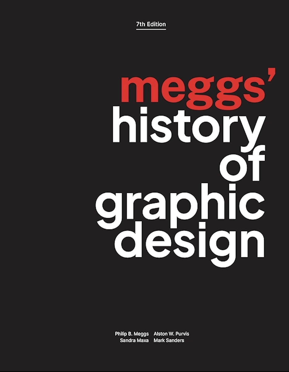
Published in late September, the seventh edition of Meggs’ History of Graphic Design is the most recent of a venerable textbook that has served as a standard reference since it was first published by Philip Meggs in 1983. Moreover, it has a pronounced Baltimore connection, as it was co-authored and designed by Sandra Maxa and Mark Sanders, who have both taught at MICA (Sanders left the school in 2022); the two are also partners at Q Collective, a design studio based in Baltimore, and are married to each other. And while the new edition retains large segments of earlier editions, it also features considerable innovations. The result is a significant, if not always entirely satisfying, shift in the standard account of the history of visual communication.
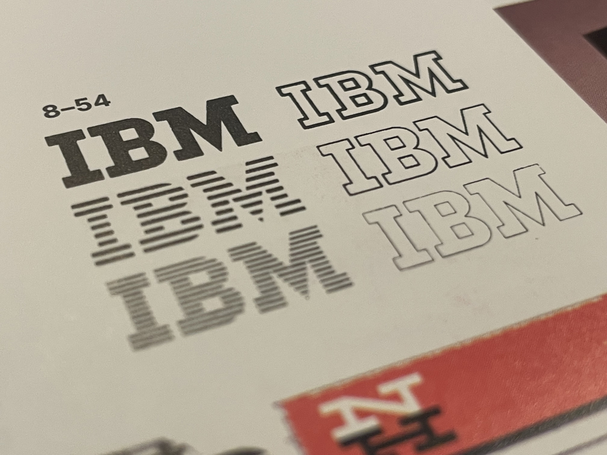
Paul Rand's iconic IBM logo
Book cover
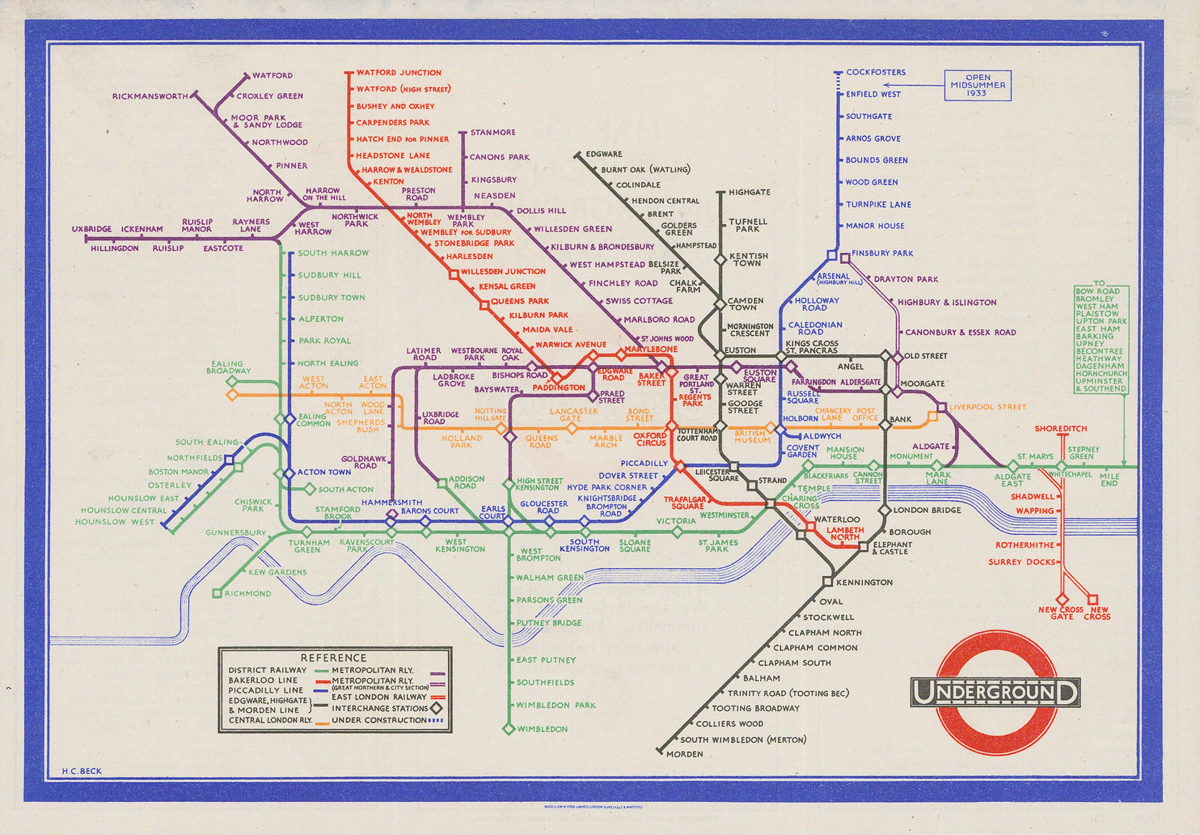
That’s not to say that this is a completely revisionist endeavor. Looking for an image of a proto-cuneiform tablet, or Paul Rand’s iconic IBM trademark? No worries—they’re still here, along with William Caxton’s pioneering typographic work, John Baskerville’s icily elegant compositions, Henry Beck’s beloved London Underground map, and Paula Scher’s raucously energetic 1995 poster for the Public Theater. Abram Games’ clever 1942 poster recruiting blood donors deservedly finds a place, and so does George Lois’ cover for the April 1968 issue of Esquire, which cast Muhammad Ali as a modern Saint Sebastian—and which was recently chosen as the most influential magazine cover of all time. The canon, in short, is still in evidence.
But this new volume also enlarges the canon, and resists a standard organizational principle. Aware that earlier editions had been criticized for their Eurocentric leanings, Maxa and Sanders worked with an advisory group to diversify their body of examples through the introduction of works by designers of color and a more global perspective. Since merely inserting new examples into an existing narrative would hardly be productive, they also broke the uninterrupted chronological flow that had characterized the text.
Thus, their text centers around twelve chapters dedicated to creative activities (writing, exalting, mobilizing…). Each of the chapters is generally chronological, and a handsome timeline and dense nine-page overview offer dutiful narrative histories of graphic design. But this text replaces a single account with multiple thematic lenses. Or, as Maxa explained to me, their new edition “places more emphasis on the context and motivations around creating graphic design than on chronology.”
There are also some new design features. The clean, assertive title page—a real departure from the busier openings of previous editions—declares the value of clarity and directness. That’s then reinforced in dozens of full-page spreads given over to relatively large reproductions of images. Sometimes appearing as two-page, facing layouts, they encourage the reader to ponder visual relationships between examples, instead of quickly toggling between the text and the thumbnail images that appear in the margins of ordinary pages. Again, one senses a confidence in the communicative ability of simple, well-designed visuals.
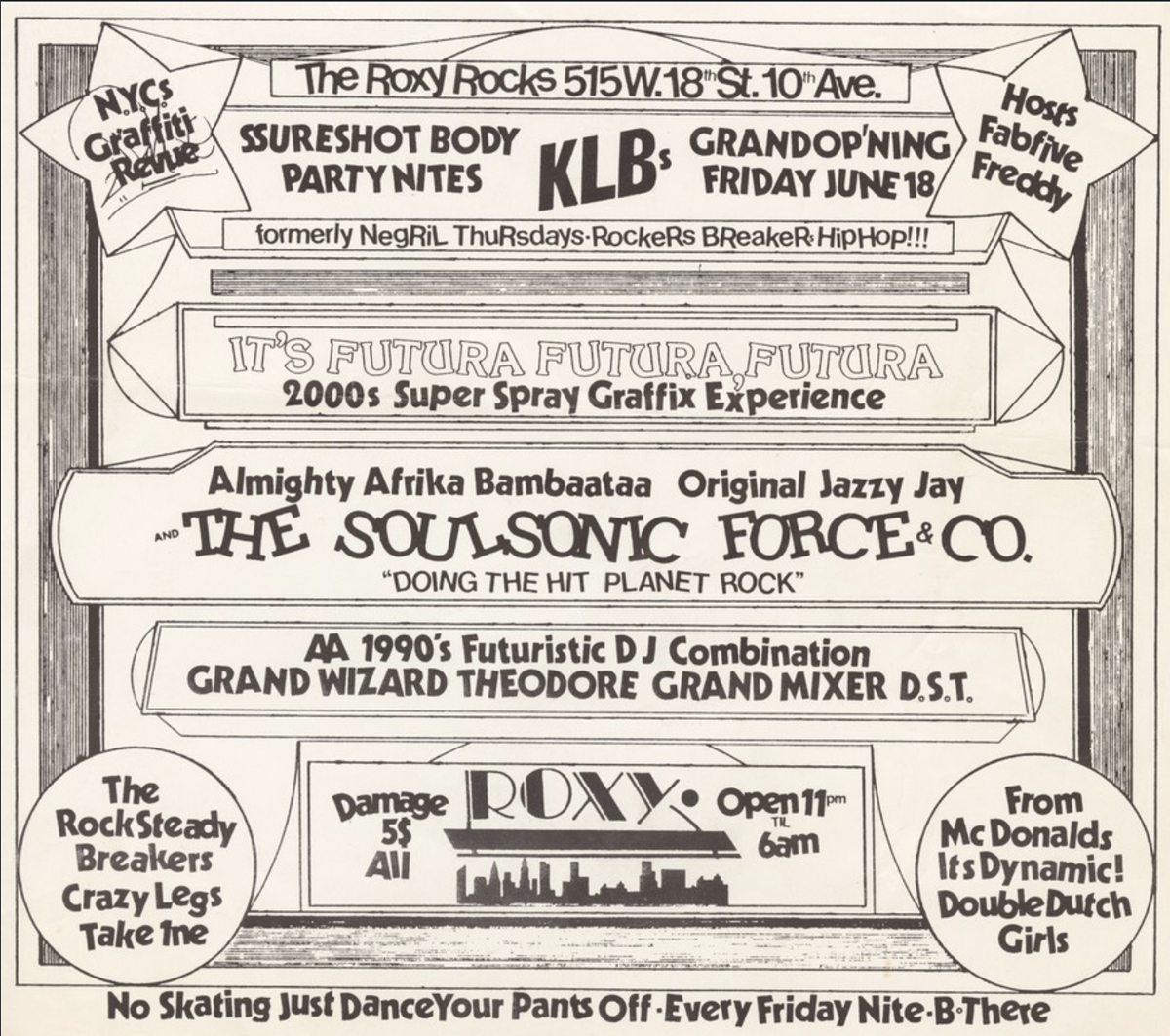
Phase II Roxy June 18 1983 flyer
And how does all of this play out, in practice? Certainly, there are some real gains. A reproduction of a flyer by PHASE 2 effectively embodies the off-kilter energy of the 1980s hip-hop scene in New York City, and a discussion of the winter counts, or pictographic chronicles, executed by Lakota artists is welcome and intriguing. An elegant 10th-century bowl speaks to the restrained tastes of medieval Abbasid ceramists. The work of Emory Douglas, whose designs for The Black Panther still express urgency, is given its due, and a look at the “1000 Times No” wall paintings of Bahia Shehab—a Lebanese-Egyptian designer whose teeming stenciled letter forms rejected principles such as military rule, violence, and autocracy—is fascinating.
Importantly, too, this is not just inclusivity for the sake of inclusivity. In several cases, these newly introduced examples generate substantial heat through their placement. A spread on page 334 juxtaposes a coolly modernist calligraphic text by Kamal Boullata, a Palestinian artist associated with the Hurufiyya movement in the 1980s, with a sharply geometric 2010 poster honoring Chopin’s 200th birthday, by Nancy Skolos and Thomas Wedell. It’s a lively and unexpected pairing that yields an exciting cross-cultural conversation. Likewise, the coupling of works by William Playfair (who pioneered the line graph, bar chart, and pie chart in the late 1700s) and W.E.B. Du Bois (whose infographics representing African-American life won a gold medal at a 1900 exposition in Paris), is terrific, as it brings two very different designers into a meaningful conversation.
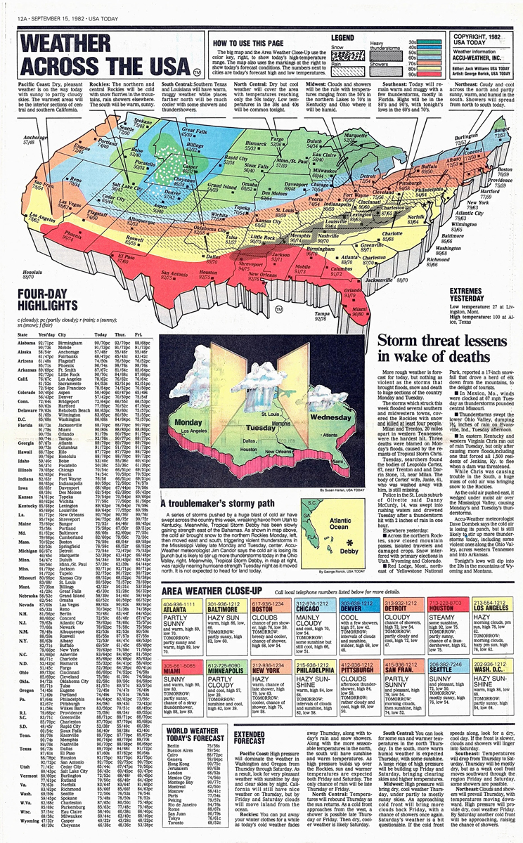
Other newly introduced examples pay dividends of other sorts. The importance of lithography was always noted in earlier editions of Meggs, but the actual physicality of the process often went unillustrated; here, a picture of a lithographic stone neatly conveys the genre’s material basis. Older readers, meanwhile, may feel a warm nostalgia on seeing a reproduction of a USA Today weather page from 1982—and a bittersweetness upon reading of Richard Curtis’ prescient sense that “readers scan graphics and read photo captions more often than they read entire articles.” Indeed. And pretty much everyone will respond to the New York Times front page from May 24, 2020: an unillustrated list of nearly 1,000 Americans who had died of Covid. As Sanders and Maxa note, “dense typography conveys both the vastness and humanness of the Covid-19 pandemic.” That’s true, but it’s also jarring to see the pandemic already finding a place in a textbook: our collective trauma, now part of a historical lesson.
Again, all of these examples are placed in themed chapters that, as the authors put it, “articulate the motivations for creating visual communication.” In many cases, this is both reasonable and productive. It’s totally appropriate, for example, to think of cigarette ads in terms of persuasion (rather than in purely formal terms), and it’s interesting to be prompted to think of subway maps or public signage as efforts at unification. The chapter on writing coheres quite naturally, and a chapter entitled Criticizing nudges readers to consider the activist impulses that powered the Arts and Crafts movement, early political cartoons—and the journal Safar, which was founded to address a dearth of critical analysis in the Arab world.
Perhaps inevitably, though, this ambitious restructuring does result in occasional awkward or unclear moments. There are repetitions: the MTV logo, for instance, appears in both Inventing and Unifying, and we are told twice, in two different chapters, that Gutenberg was a key figure in the development of movable type. And the distinction between some themes is not always crisp: does Alois Senefelder’s A Complete Course of Lithography belong in Inventing, or in Explaining?
Admittedly, the authors anticipate such questions. Indeed, they note that the chapters were conceived as stand-alone units, and they encourage debate about the ideal placement of examples. Fair enough. Still, it can feel strange to read about the invention of movable type on page 98—only to have to wait 169 pages for a corresponding discussion of early printed books made with movable type (on page 267).
One could quibble, too, with the approach to the illustrations. Many of them are so small that salient details are simply illegible. It’s encouraging that a picture of a well-known mihrab from Isfahan was added to this edition—but since the image is only 5 cm tall, the astounding details in the niche are invisible.
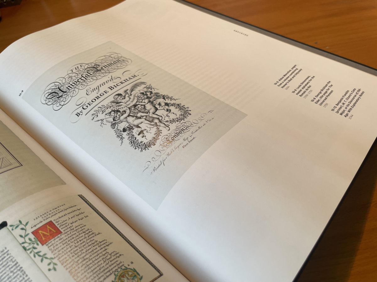
And where the inky unevenness of handwritten hieroglyphs in an Egyptian Book of the Dead and the crispness of the chiseled inscriptions on a Roman tomb were clearly discernible in the large illustrations of earlier editions, they are now undetectable: victims of miniaturization. Indeed, even in cases where there is abundant available space, it’s not used: the image of the title page for The Universal Penman, for instance, could (and should) be roughly twice as large as it is.
George Bickham, "The Universal Penman" title page as reproduced in "Meggs'"
But size isn’t the only issue here. In several cases, relevant images have been jettisoned, weakening the point at hand. For example, the caption accompanying Chip Kidd’s witty cover for David Sedaris’ Naked correctly notes that the book, whose outside cover pictures a pair of briefs, actually “has two covers in one—an X-ray is revealed after the dust jacket is removed.” But where some earlier editions usefully pictured both covers, thus illustrating the full premise, here we see only the inner book cover: the punch line, without the accompanying setup.
Chip Kidd’s cover design for David Sedaris: “Naked,” 1997
Perhaps budgetary concerns are partly to blame; after all, illustrations can be quite expensive. But a concern for the bottom line can’t really explain the thinly researched quality of passages that accompany some of the new examples. Several of these, such as an entry on Emmett McBain and an analysis of The Indians’ Book, a 1907 work designed largely by Angel DeCora, lean uncomfortably heavily on online sources (a 2017 Design Observer essay by Lilly Smith and a 2020 Letterform Archive post by Neebinnaukzhik Southall), without giving clear credit to the original authors or quoting borrowed passages.
In turn, a discussion of the famous Topkapi scroll (which “represents a sophisticated unified sign system that reflects religious, ideological, mathematical and mystical concepts from premodern Islamic culture”) is frustratingly vague: what are those concepts? And the designer behind the logo and poster for the 1964 Tokyo Olympics is identified as both Yusaku Kamekura and Kamekura Yusaku. No doubt the authors mean well in diversifying their roster of designers, but missteps like these suggest a basic tentativeness or uncertainty that is unnerving.
Am I asking too much? Is it unfair to ask, after reading that McBain’s lively 1973 ad for McDonald’s features “imagery and copy that were specific to the Black community,” exactly what is meant by that claim? Is it unreasonable to wish that a history of graphic design mentioned, however briefly, social media, or tattoos, or the evolution of the ubiquitous Starbucks logo? Maybe so, for of course a textbook can only do so much—and this edition of Meggs’ does in fact do a good deal, by re-imagining the way in which the history of visual communication is told, and by crafting a more inclusive and contemporary roster of examples.
We have come a long way over 42 years, and that’s apparent here. Philip Meggs’ tendency toward bold, poetic claims (“The invention of writing brought the luster of civilization to people and made it possible to preserve hard-won knowledge”) now seems dated, and has given way to more neutral, objective wordings (“Writing enabled the recording and transmission of ideas across time and space.”) The idea of a master narrative and the Eurocentric bias of earlier editions of this text have been pressured, and forced to make room for multiplicity and inclusivity. The history of graphic design appears, here, fresher, livelier and more relevant.
“I hope,” Sanders told me, “our expansive view of graphic design invites people into the book, and into the discipline.” That seems likely. Naturally, there is always more work to do: the sea of images that comprise the history of graphic design is vast, centerless, and heaving. But Sanders and Maxa, capable guides, have done their part in steering this ship on its latest voyage.
MDFF Celebrates the 55th Anniversary of "Multiple Maniacs" with a Special Friday Night Screening at the Parkway
As America deindustrialized, John Waters and his keen observations of Baltimore's decadence have become a chief export. What more content can be extracted? Refined?
China Martens' Debut Novel is a Striking Polaroid of Early Noughties Mayhem and Motherhood in Baltimore
Martens is a focused storyteller who delivers a strong narrative. The book is achingly heartfelt yet a whole lot of fun, a heady read by a writer who knows her craft and lets it fly.
This weekend, September 12-14, indulge in your lit-love with the return of the Baltimore Book Festival. With over 80 authors and six stages, the sheer number of events, readings, and panels on the itinerary could fill a library in itself. Here are a few recommendations from our team.
Plant Stylist and Social Media Influencer Reigns King of the Urban Jungle
A Baltimore native and a creative force, Carter is changing the way people think about greenery in their homes, encouraging the masses to bring nature indoors.